
dotCMS's interface for editing pages, the Universal Visual Editor (UVE), is a comprehensive, multi-paradigm solution to page editing. From the UVE, you can preview a page; add, edit, or arrange content; adjust layouts; set rules; configure experiments; run workflows; and more.
By providing a unified experience across both traditional and headless contexts — whether editing local or remote pages and web applications — the UVE is one of clearest expressions of dotCMS's hybrid character.
Read more about configuring the UVE to work headlessly.

Toolbar
Across the top is the UVE's main toolbar, visible while the page content editor is selected in the navigaton bar. It contains the following functions and selectors.

Preview
The Preview button allows you to quickly switch between the display sizes of different devices.

In addition to default devices, you can define your own using the built-in Device Content Type. The + button in the upper right corner of the dropdown quickly takes you to the Content Search tool filtered to the Device type, to quickly add further such preview devices.
The Preview dropdown also includes an “Open Published Version” link, which opens the current live version of the page in a new tab.
Bookmark
The Bookmark button allows you to bookmark the current page. For more information on bookmarking in dotCMS, see the documentation of the Pages Tool, where they are used.

Copy URL
Simply enough, the Copy URL button copies the URL of the page you're editing to your clipboard.
API
The API link opens a new tab containing the full JSON object of the current page's Page API response, allowing quick reference to the page's underlying data.
Language Selector

You can use the language selector to easily switch between different versions of the same page across different defined languages, where available. For more information, see Configuring Languages, or the Multilingual Content section generally.
Persona Selector

If you're using personalization, this selector allows you to switch between versions of the current page tailored to different personas.
Selecting a visitor Persona sets the Persona on the page, triggers rules, and re-renders the page to display the appropriate personalized content (if any exists).
Visibility or accessibility may vary from persona to persona, based on back-end user permissions.
Workflow Execution

The proverbial “Big Red 'Do Stuff' Button” is, in this case, the sharp blue one. The Workflow button allows the selection of applicable Workflow.
The actions displayed will be determined by the Workflow assigned to the Page Content Type, the current Workflow step the content is in, the configuration of the Workflow actions in that step, and your permissions.
Within a given Workflow step, the button's dropdown will display all applicable actions in the same order order in which they appear in the Workflow; the first applicable action is the button's default behavior and label. As such, reordering the actions in the Workflow step can change the default label of the button.
Content Editor
The majority of screen real estate in the Universal Visual Editor is the editor window itself, chiefly consisting of a pane displaying an editable preview, including the page's various containers and the content, widgets, or forms they hold.
On the pane's right side lies the Content Palette, which allows the quick population of containers.
Editor Window
Within the editor, each container displays a + button through which you can populate the container with either content, a widget, or a form.

Each container similarly has several buttons on the upper right:

| Button | Action |
|---|---|
<> (Triangle Braces) | Shows a list of VTL files relevant to the container's contents — including widget code, the VTL responsible for rendering in the case of a File-Based Container, and any others included through the #dotParse directive. This button will not display if there is no relevant VTL file. |
✥ (Arrows) | Drag this button to reorder content within the container. |
x | Remove the contentlet from the container. (This does not delete the contentlet from dotCMS.) |
| ✏️ (Pencil) | Click to directly edit the contentlet or widget displayed in the Container. |
The Content Palette
Clicking on any displayed Content Type in the Content Palette provides a list of contentlets of that type.
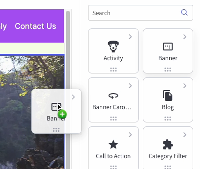
Drag and drop any item from this list to place it into a container. Alternately, you may drag and drop the Content Types themselves to create a new contentlet of that type and immediately place it in the container.
Content Palette Displayed Types
The Content Palette automatically shows all Content Types accepted by the Containers in the Page, as well as up to 100 widget types.
You may optionally exclude Content Types from the Content Palette, even if a Container would otherwise accept them, by assigning a comma-separated list of Content Type variables to the following environment variable (shown below in its default state):
DOT_CONTENT_PALETTE_HIDDEN_CONTENT_TYPES: 'Host,Vanityurl,Languagevariable,persona,forms'
Navigation Bar
Appearing on the far right-hand side of the UVE is perhaps its most fundamental menu, as everything discussed above falls within the scope of its first item — Content.

At the far right of the UVE display, a sequence of tabs allow navigation between different page-specific editable parameters:
| Action | Description |
|---|---|
| Content | Allows you to add and modify the content displayed on the Page. |
| Layout | Allows you to modify the layout of the Containers in the Page, to create a custom layout as though it were a Template. |
| Rules | Displays and allows you to add and edit Rules that apply to this Page only. |
| A/B | Views the page's Experiments. |
| Page Tools | Provides a panel of links to services to help evaluate a page against best practices on security, accessibility, etc. (See image below.) |
| Properties | Opens the page properties via the contentlet editor. |